
Where the data comes from
This dashboard is the consumer surface of the Bali Properties data platform. Two pipelines (REID aggregates + 9-site scraper) and an Airtable mirror of Investland's own portfolio converge into a single Supabase Gold layer. This case study covers what was built on top.

Stack
Next.js 16 with Turbopack, Tailwind v4, shadcn/ui for primitives, Supabase for auth + Postgres + Storage, Leaflet via react-leaflet-cluster for the map, TypeScript strict end-to-end, and GitHub Actions wired to Slack for release notifications. The dashboard is internal, auth-gated to Investland's organization, so design choices favor density and operator workflows over public-facing aesthetics.
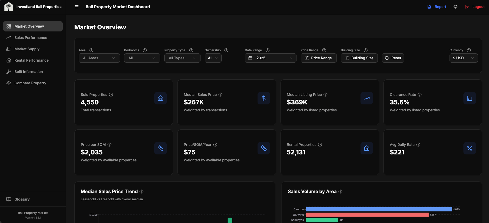
Aggregate market indicators
Top-level dashboard view: KPI cards for median sold price, days listed, and yield estimates, plus trend charts faceted by neighbourhood, bedroom count, and contract type. Three design decisions worth pulling out:
- Adaptive filters. None of the year options, source options, or date defaults are hardcoded. Each is queried at request time from the actual data so the dashboard stays correct as the database evolves (new sources added, new years accumulated). When a scraper picks up a new site next quarter, the filter list updates automatically.
- Weighted aggregations, not simple averages. Same methodology described in the data platform case study: weighted by active inventory at each (neighbourhood × bedroom × type) cell. Simple averages skew dramatically on long-tail distributions like real estate prices.
- Currency-aware filtering at the column level. Prices are stored in 5 native currency columns (IDR, EUR, USD, AUD, SGD), not converted on the fly. The price-range filter queries
price_eurdirectly when the user has EUR selected, noWHERE price * fx_rate BETWEEN ...gymnastics.
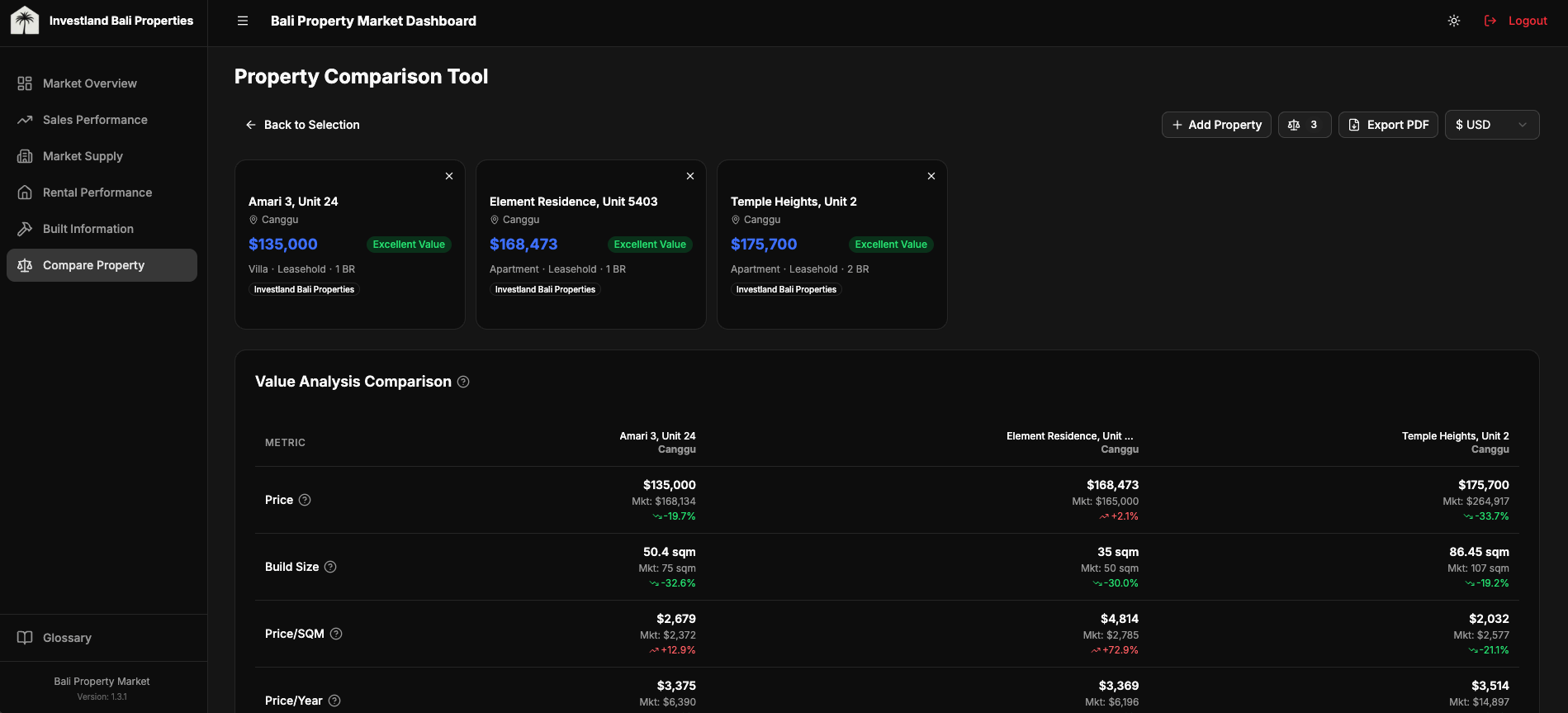
Compare Property
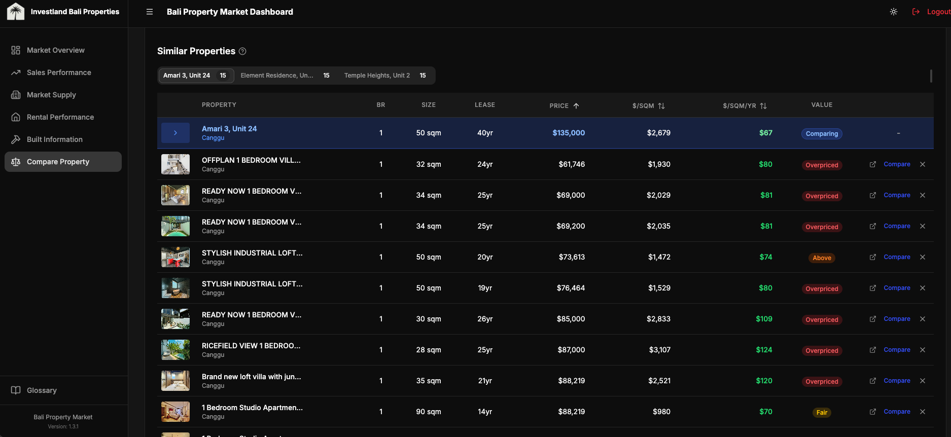
The feature that gets used most. A user picks up to five properties and the dashboard renders them side-by-side: photos, location, key attributes, price-per-square-meter and price-per-build-year against weighted-median market benchmarks, and a rule-based value rating per property (excellent / good / fair / high / overpriced) derived from the deviation between the property's price per dimension and the market median for its (neighbourhood × bedroom × type) cell.
Each comparison also generates a suggested negotiation offer range. Lower bound: market discount % + a 10% buffer below asking price. Upper bound: market discount + 3%. Where REIDBase coverage is sparse (a niche neighbourhood, an unusual bedroom configuration), the calculation falls back to scraped statistics from the same cell. This is internal-tool UX: the user doesn't need an explanation of which source backed a number, but the value range needs to be defensible if questioned, so the source lineage is exposed in a tooltip.
const OFFER_RANGE_LOW = 0.10   // aggressive: 10% below asking + market discount
const OFFER_RANGE_HIGH = 0.03  // conservative: 3% below asking + market discount

async function compareProperty(target: Property): Promise<ComparisonResult> {
  const metrics = calculatePropertyMetrics(target)
  const market = await getMarketBenchmark(
    target.area, target.bedrooms, target.type, target.contract_type
  )

  // % deviation from market median, on the dimension that matters for this contract
  const priceSqmYearDiff = deviation(metrics.pricePerSqmYear, market.price_per_sqm_year)
  const priceSqmDiff = deviation(metrics.pricePerSqm, market.price_per_sqm)

  const ratingBasis = target.contract_type === 'leasehold' && priceSqmYearDiff !== undefined
    ? priceSqmYearDiff
    : priceSqmDiff

  const valueRating = market.data_available ? getValueRating(ratingBasis) : 'fair'
  // 'excellent' < -15% | 'good' -15..-5% | 'fair' -5..+5% | 'high' +5..+15% | 'overpriced' > +15%

  // Negotiation range: market discount + 3-10% buffer below asking
  const marketDiscount = Math.abs(market.discount_rate) || 0
  const suggestedOfferLow = target.price_usd * (1 - marketDiscount - OFFER_RANGE_LOW)
  const suggestedOfferHigh = target.price_usd * (1 - marketDiscount - OFFER_RANGE_HIGH)

  return { valueRating, suggestedOfferLow, suggestedOfferHigh, market }
}
The thresholds are deliberately blunt. A negotiation offer range that adjusts to ±0.3% on every market tick gives stakeholders no signal; they'd ignore it. A coarser tier with a clear range survives the imprecision in the underlying data.
Map view
21K markers crashes naive Leaflet. The interesting question isn't "how to render markers." It's "how to make 21K markers feel like 21." Four decisions, in order of impact:
- Server-side bounding box queries. The map only ever asks Supabase for properties inside the current viewport. Pan and zoom mutations debounce-fetch a fresh slice. The client never holds 21K rows.
react-leaflet-cluster(built on supercluster) for the rendering layer. Out of the box it groups markers by zoom level and tile. CustomiconCreateFunction()overrides the default cluster bubble for color-coding by listing source.- Selected property always rendered outside the cluster. A user clicks a marker, the map zooms toward it, but the cluster algorithm might re-absorb it on the next zoom level. Forcing the selected property to render as an unclustered marker keeps the user's selection visible regardless of clustering state.
- Lazy-loaded popup images via internal image-proxy API. Each marker's popup shows a thumbnail. Loading 21K thumbnails up front is unworkable; instead, the popup component requests the thumbnail through an internal proxy that handles caching and source-host normalization.
import { MarkerClusterGroup } from 'react-leaflet-cluster'

export function PropertyMap({ properties, selectedPropertyId }: Props) {
  const mappable = useMemo(
    () => properties.filter((p) => p.latitude != null && p.longitude != null),
    [properties]
  )

  // Force MarkerClusterGroup remount when result set changes (avoids stale clusters)
  const clusterKey = useMemo(() => mappable.map((p) => p.id).join(','), [mappable])

  // Selected property rendered OUTSIDE the cluster (always-visible highlight)
  const selected = useMemo(
    () => selectedPropertyId ? mappable.find((p) => p.id === selectedPropertyId) : undefined,
    [mappable, selectedPropertyId]
  )

  return (
    <MapContainer center={BALI_CENTER} zoom={11} className="h-full w-full">
      <TileLayer url="https://{s}.tile.openstreetmap.org/{z}/{x}/{y}.png" attribution="© OSM" />

      <MarkerClusterGroup key={clusterKey} chunkedLoading iconCreateFunction={createClusterIcon}>
        {mappable
          .filter((p) => p.id !== selectedPropertyId)
          .map((p) => (
            <Marker key={p.id} position={[p.latitude, p.longitude]}>
              <Popup>{/* lazy-loaded thumbnail via /api/image-proxy */}</Popup>
            </Marker>
          ))}
      </MarkerClusterGroup>

      {selected && (
        <Marker position={[selected.latitude, selected.longitude]}>
          <Popup>{/* always-visible selected property */}</Popup>
        </Marker>
      )}
    </MapContainer>
  )
}
The viewport-bounded fetch is the load-bearing pattern here. Without it, the cluster library is doing accurate work over an inaccurately large dataset.
Dynamic report generation
A 13-page PDF that adapts to the data, not a static template. Four insight modules (salesInsights, rentalInsights, builtInsights, supplyInsights) each evaluate per-metric thresholds against the selected period and emit conditional narrative paragraphs grouped by chart. An insight only renders if its underlying condition holds.
A representative excerpt:
export function generateSalesInsights(data: ReportSalesData): ChartInsight[] {
  const insights: ChartInsight[] = []
  const { totals, trendData } = data

  // KPI Summary: content adapts to what's in the data
  const kpiInsights: string[] = []

  if (totals.avgDiscount !== 0) {
    const pct = Math.abs(totals.avgDiscount * 100).toFixed(1)
    if (totals.avgDiscount < 0) {
      kpiInsights.push(
        \`Sellers are achieving prices \${pct}% below listing on average; buyers have negotiation power in this segment.\`
      )
    } else {
      kpiInsights.push(
        \`Properties are selling \${pct}% above listing on average; strong demand and competitive bidding.\`
      )
    }
  }

  if (kpiInsights.length > 0) {
    insights.push({ chartTitle: 'Sales Summary', insights: kpiInsights })
  }

  // Price trend: only renders if we have ≥2 data points and a meaningful delta
  if (trendData.length >= 2) {
    const first = trendData[0].median_sold_price
    const last = trendData[trendData.length - 1].median_sold_price
    if (first > 0 && last > 0) {
      const change = ((last - first) / first) * 100
      const trendInsights: string[] =
        change > 10  ? [\`Median price rose \${change.toFixed(1)}%, a strong upward trajectory.\`] :
        change < -10 ? [\`Median price fell \${Math.abs(change).toFixed(1)}%, a cooling market.\`] :
                       [\`Median price stable, \${change > 0 ? '+' : ''}\${change.toFixed(1)}% over the period.\`]
      insights.push({ chartTitle: 'Price Trend', insights: trendInsights })
    }
  }

  return insights
}
Each module emits zero to many ChartInsight groups. The PDF assembler queries each module, sorts the union by significance (KPI summary → trend → volume), and lays out as much as fits. A market period with little signal produces a shorter PDF; a turbulent quarter produces the full 13.
Engineering details
A handful of choices worth surfacing without dwelling.
Auth and access. Supabase Auth handles sign-in; RLS policies scope every read and write to the user's organization. Adding a new user to an organization is a single insert; cross-org leaks aren't possible without subverting the policy itself.
State and performance. Filter state persists per-page via sessionStorage so a user can drill into a property and return to the same filtered view. An in-memory query cache (TanStack Query) deduplicates concurrent requests and serves stale-while-revalidate for the heavy aggregation queries.
Multi-currency at the type layer. Every price-aware component accepts a currency parameter and reads from the native column for that currency. Conversion only happens when reading a property whose native currency doesn't match the requested display currency.
/**
 * Get price in a specific currency directly from a property's price columns.
 * Returns { value, isNative } so the caller knows whether conversion is needed.
 *  - isNative=true:  value comes from the DB column → format raw, no FX math
 *  - isNative=false: value is price_usd → caller must convert via FX rate
 */
export function getPropertyPrice(
  property: { price_usd?: number; price_idr?: number; price_eur?: number; price_aud?: number; price_sgd?: number },
  currency: string
): { value: number | undefined; isNative: boolean } {
  if (currency === 'USD') {
    return { value: property.price_usd, isNative: true }
  }

  const native = {
    IDR: property.price_idr,
    EUR: property.price_eur,
    AUD: property.price_aud,
    SGD: property.price_sgd,
  }[currency]

  if (native !== undefined && native !== null && native > 0) {
    return { value: native, isNative: true }
  }

  // Fallback: caller converts from USD when native column is missing/zero
  return { value: property.price_usd, isNative: false }
}
DX and release. TypeScript strict mode, no any escape hatches. Turbopack as the dev compiler. GitHub Actions runs type-check + lint on PR; on merge to main, a workflow posts a release note to the team Slack channel with the commit summary.
Tradeoffs and lessons
-
Native currency columns beat on-the-fly conversion for an analytics product. Five columns × static FX = consistent display + simpler WHERE clauses + indexable ranges.
-
Marker clustering at 21K isn't a Leaflet primitive; it's an architecture decision. Server-side bbox queries + supercluster + custom icons + selected-outside-cluster. Each piece compensates for a failure mode of the simpler alternative.
-
Rule engines beat templates for domain reports. When insight relevance depends on data shape, hardcoded structure fights you. The 30-second auto-report is the visible payoff; the underlying decision is "let the data drive the document."
-
Internal-tool UX has different rules. Five-property compare, batch operations, session persistence, dense filter bars: none of these survive aesthetic minimalism, but all of them are what makes the product useful for an operator running 80 comparisons a week.